Snapshot performance

As I look outside my window, it’s a beautiful sunny winter day with blue skies and mild temperatures. Just a week ago, we hit a major cold spell with record lows, snow, and very little sun. As we all know, the weather is very difficult to predict. It changes not just monthly, weekly or daily but hour by hour. Weather forecasters do their best in predicting the weather but even they do not have 100% accurate foresight. They use trends and research tools. They use the past to help them understand the future. And in the end, it is just a game of probabilities.
Related article: Three P’s of investing
Predicting investments are like predicting the weather
We can draw some similarities between the weather and the investment industry:
- Firstly, both are imperfect sciences. Financial author, George Hartman once said, “It is better to be approximately right than precisely wrong”. I believe perfection does not exist in the investment industry. Instead, successful investing lies in your ability to increase your probability of being right more than you are wrong.
- Also, just like the seasons come and go with some regular pattern, markets can show some long-term patterns too. Markets go through cycles, which includes ups and downs. Unfortunately, it is the timing of the ups and downs that is impossible to predict. When it comes to predicting the future, market timers have a tough task ahead of them.
- And finally, just like the weather can change very quickly, so can the market environment. We are led to believe that more risk rewards over time. While this may be true in most circumstances, we must also understand that more risk means that the environment can wreak havoc on our investments.
Related article: Realities of the stock market
Snapshot performance
As a guy who likes numbers and statistics, I’ve always said I can make any investment look good with the facts. It just depends on what facts I want to show you.
One of the problems in the investment industry is a 5 or 10-year performance number can be misleading because it only takes one or two good years to make a long term number look good. When you look at a fund or an investment at a single point in time, you are looking at a snapshot of that investment at one single point in time and sometimes that can trick you.
And so we get to the point of this message . . . her’s an example of how snapshot performance numbers can be very dangerous and misleading.
| 1 year | 2 year | 3 year | 4 year | 5 year | 10 year | |
|---|---|---|---|---|---|---|
| Fund XYZ | 33.9 | 27.7 | 22.6 | 23.1 | 20.3 | 16.6 |
In this example, you will find a fund that has provided a compound average annual return of 16.6% over the last 10 years. By any standard, this data is impressive and who wouldn’t invest in an investment like this?
Once again I mask the fund’s identity because it would not be fair for me to make judgments on whether this fund is good or bad. Rather this fund serves to prove a point.
The data you see here is typical of what you will find anywhere. Many investors use this information to invest thousands of their hard-earned investment dollars. The problem you see here is this data is based on snapshot performance (one ‘snapshot’ in time).
You see, any return is calculated based on two points in time: a start date and an end date. What happens in between is not reflected in these numbers. A change in the start date or the end date can dramatically change the outlook of this investment. Even a shift in one single day can have the power of changing these numbers dramatically. In the industry, we call this start date and end date bias.
| 1 year | 2 year | 3 year | 4 year | 5 year | 10 year | |
|---|---|---|---|---|---|---|
| Fund XYZ | 33.9 | 27.7 | 22.6 | 23.1 | 20.3 | 16.6 |
| Fund XYZ | 9.2 | 16.5 | 17.7 | 16.7 | 13.1 | 13.6 |
Here we have the same investment but two different pictures. How can that be? Simple! Two different snapshots in time (and they are only months apart). End and start date bias usually have a more dramatic effect on the short-term numbers but a 2% difference over 10 years is a significant difference.
Another example
In 2019, the 1-year return for the TSX was a very respectable 22.9%. It is shown in the blue line below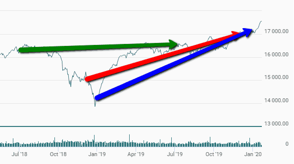
Remember that the rate of return is the slope between the start point (Jan 1, 2019) and the endpoint (Dec 31, 2019) so the blue line with the biggest slope has the highest return.
The red line is the 1-year return (15.7%) for the period exactly one month earlier (Oct 1, 2018, to Nov 30, 2019). Although this is a very good return, the blue line is showing a higher return simply because of the drop in late 2018 which is inflating the numbers for the calendar year 2019. Poor performance in the 4th quarter of 2018 helped make 2019 look really strong
The Greenline is the 1-year return of the TSX from July 1, 2018, to June 30, 2019. As you can see, this line is very flat with a 3.87% return. Three snapshots of the same market produce 3 different pictures.
The moral of the story
As an investor, you must be careful about how you use snapshot performance numbers to judge the merits of an investment. Looking at the typical data you see on a daily basis can be very misleading and dangerous because these numbers can change as quickly as the weather.
Be careful of awards, ratings, and especially snapshot performance. Good research leads to good decisions and investors should use more than these things to choose good quality investments.
Related article: How do you judge performance?
Don’t pick investments based on one snapshot in time. It’s not unlike the weather. You might look outside on a hot summer day when the sun is shining bright but within days and even hours, the weather could change and it could be windy, raining and cold.
