Proper diversification using correlation charts

Tom and Marilyn, have 18 different investments in two RRSP portfolios. Most people would think that with 18 investments, you must be diversified but are they diversified properly? When I ran a correlation analysis, 15 of the funds were highly correlated and only 3 of the funds were not correlated. Not surprisingly, they were funds invested in different asset classes. Let’s delve into correlation analysis a little deeper.
What is efficient and effective diversification?
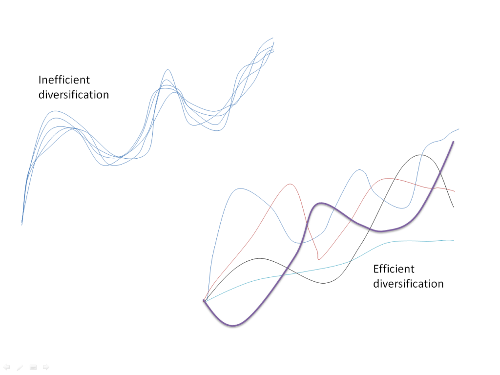
In this diagram we have two portfolios with 5 different investments. The first portfolio has 5 investments that do the exact same thing. All 5 investments go up and the same time and all 5 investments go down at the same time. These funds are highly or positively correlated. The second portfolio is more efficient because it simply has a portfolio of 5 investments that do different things at different times, which helps mitigate risk. These funds are not correlated or negatively correlated. This is called efficient diversification.
I’ve been watching correlation data quite closely and it really does show that effective diversification comes from asset diversification, not investment diversification.
What is investment diversification?
When you hold lots of different investments but not necessarily in different asset classes. Tom and Marilyn had a portfolio that was a good example of investment diversification. Here’s another example I ran into recently:
Jason has a RRSP plan with CI Mutual Funds. He has 7 different investments but they all have high exposure to equities. Let’s take a look at the correlation of these 7 investments
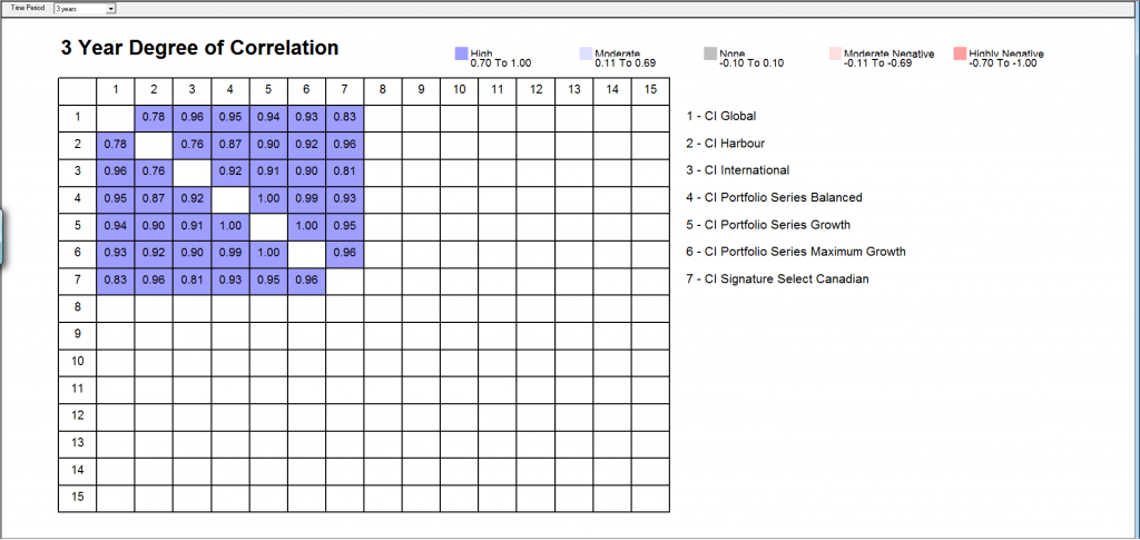
As you can see, the funds are highly correlated. In fact, 4 of the funds (CI Interntational, CI Portfolio Balanced, CI Portfolio Growth and CI Maximum Growth) are all almost perfectly correlated (a number close to 1).
What is asset diversification?
Asset diversification is really another term for asset allocation. Correlation charts show that asset allocation is very important. It is important to diversify between cash, bonds and stocks mainly because these assets do not move in sync with each other. Here’s a chart showing the correlation of different asset classes
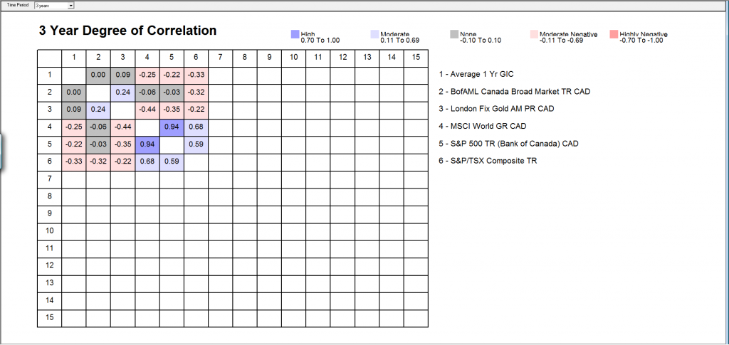
Cash, Bonds, Gold, Global markets and Canadian Equities are all correlated differently. You can see this in the numbers or the colors. One interesting point is the global markets are not as negatively correlated as you might think.
Geographic diversification is less important than you might think
If you look at this correlation chart looking at different world markets, you can see that the world markets are moving more and more in sync. Just think about the economic downturns in the world in 2002, 2008 and 2011. Markets around the world went down together. There were not many places stock investors could go to, to get away from the market drops. The only way to diversify properly was to go to different asset classes like cash or bonds.
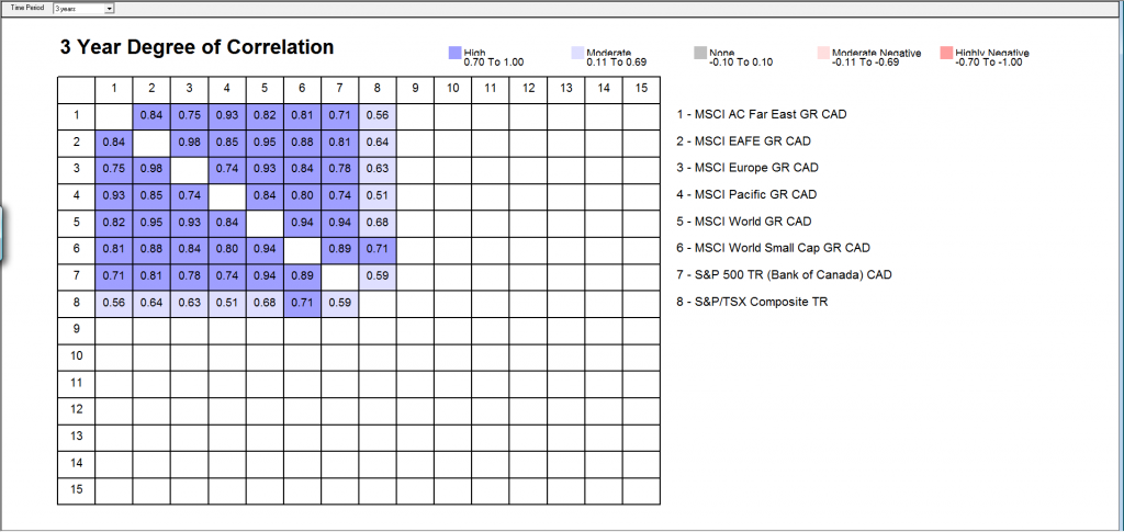
This data comes from the past 3 years but the data is similar for longer time frames. World markets are more in sync than ever because of globalization and technology. Economies and markets are around the world are more linked than ever.
Sector diversification is important
Unlike global diversification, sector diversification appears to be very important. Here’s a chart of the TSX sectors and the correlation data shows that sector do not move together all the time.
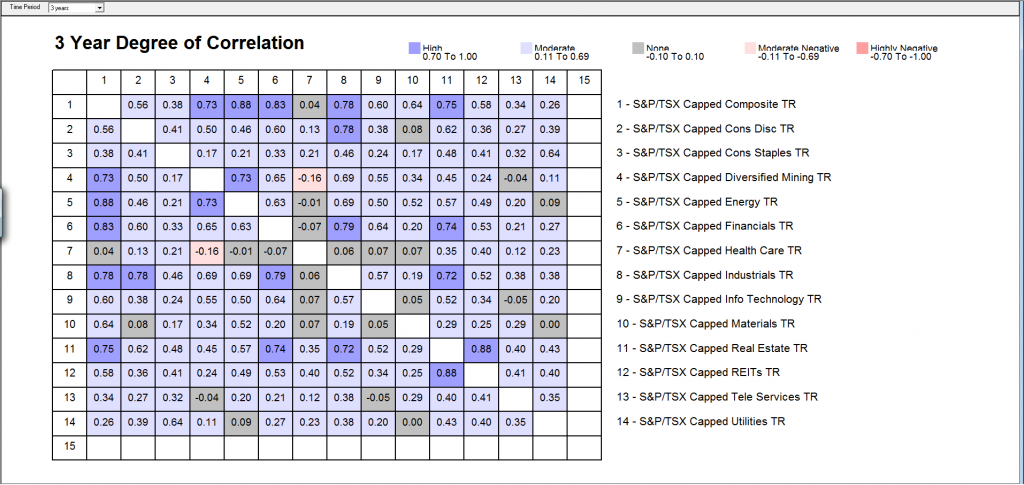
As you can see from this chart there are a two sectors are highly correlated like Real Estate and REITS (Real Estate Investment Trusts). Mining and Health Care are least correlated. In fact, the data suggests that health care is an important sector to own for diversification purposes.
Proper diversification for Jason
If we go back to Jason, remember his portfolio was diversified by investment but not by asset or sector Here’s an example of how Jason could change his portfolio within CI Funds to diversify better
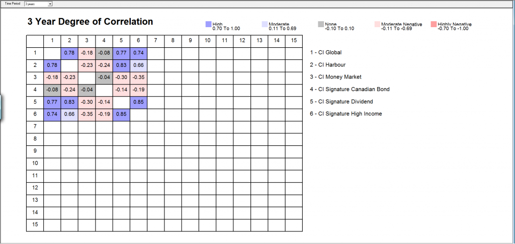
If you take this to another level, Jason may want to look outside of CI for potentially better investments. Jason may want to look at alternatives to mutual funds to access investments with lower fees. For now, I hope these correlation charts help you to understand the science of diversification a little better. Generally it’s more important to diversify by asset and by sector than it is by geography and by investment.
What do you think about diversification and correlation? Do you think these chart make a difference when it comes to designing and managing portfolios?
Comments
Diversification is very important. Gold has been my best investment for the past decade. If gold does poorly, that is OK because my stocks are doing well.
Thanks CFM! Do you own bonds and cash as well?
I’m curious what tool you used to generate the correlation charts, and if it’s available to the general public?
Hey Marc,
I used PALTRAK by Morningstar to produce these charts. It is subscription based and intended for financial professionals but I’m sure the public can buy the subscription too.
Thanks Jim!
Hi Jim, when you have the correlation matrix, how do you calculate the average portfolio correlation?
Interesting article, Jim, as this is something I’ve been thinking of for sometime. As a self-directed investor trying to get the proper asset allocation primarily using index ETFs as the majority and a sort of “core” part of my portfolio and a few individual stocks that I select based on fundamental valuation metrics as a smaller “active” part, as well as someone who has been previously licensed as a mutual funds sales representative through a previous employer, I’ve always thought that one needed both geographic and sector asset allocation, in addition to the obvious split between fixed income/equity and passive/active. However, it became increasingly difficult to try and take it *all* into account given the different sector weights of the underlying holdings in an ETF focused on a specific geography. Heighten your exposure to U.S. through U.S.-focused ETFs and you likely have also unwittingly altered your sector allocation because the Canadian and U.S. ETFs may allocate by sector differently.
Conventional wisdom, at least in the Investment Funds In Canada textbook for which I studied, seems to place a greater weight on diversifying by sector rather than geography. Your article seems to suggest that, while geographic diversification can be important and shouldn’t be completely dismissed, sector diversification is better because of the lower correlation and, you’re right, when you think about it, global markets are more likely to move in tandem than different sectors because the countries are increasingly more interconnected thanks, largely, to more open borders and freer trade. Perhaps in the days of tariffs on everything between countries, geographic diversification was the winner and, really, perhaps the asset allocation models haven’t kept up? An interesting question worth looking into. 😉
Anyway, as I like to take the LOOONNNGGG view with respect to performance of an index over time (i.e., 50-90 years), I was wondering if you knew of any research paper or data that might look at the performance of sector- versus geographic diversification over that timeframe? If neither has had superior outperformance over the other on average, perhaps more efficient correlation through sector diversification simply leads to less volatility from year to year and is more of a, “what’s comfortable to you?,” sort of thing. I like the idea of diversifying via sector versus geography better anyway, and am glad to know it’s almost impossible to achieve perfect sector AND geographic diversification with your article, but since I’m the type of person that doesn’t really think about it if my portfolio is down 20% in one year let alone react to it, it could well be a wash, if that’s what the data shows. If the data shows differently over the long term, then I might just need to do a reallocation with a bias to sector diversification. 🙂
Cheers,
Doug